The Power of Visual Comparisons: Why Tables Beat Lists
Most people compare options with a mental pros/cons list or a bullet-point writeup. Both work for two-option decisions. But once you're comparing three or more options across multiple dimensions, these methods fail, and visual comparison tables become essential.
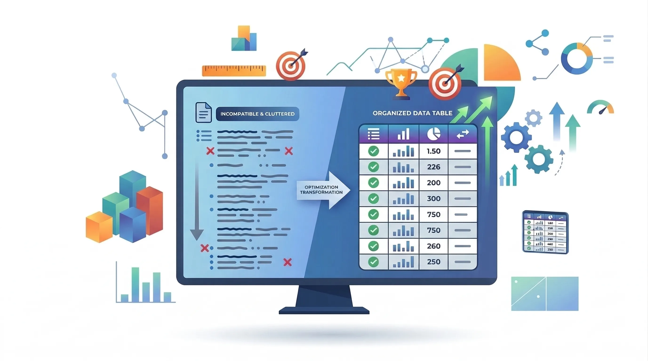
The Problem with Lists
'Top 10 Best...' articles present each option sequentially with a paragraph and some bullet points. Easy to write, but difficult to use for actual decisions. Comparing Option A and Option C requires scrolling back and forth, holding data in working memory limited to 4-7 items.
- Lists hide patterns: data scattered across sections makes trends and outliers invisible
- Lists encourage recency bias: the last option read tends to feel strongest regardless of merit
- Lists make weighting impossible: no way to adjust priorities across standalone text blocks
- Lists don't scale: 5 options is manageable, 10 is exhausting, 20 is useless
Why Tables Work Better
Tables enable parallel processing. With options in rows and criteria in columns, your eyes scan across to compare options or down to see one option's full performance. Tables leverage our ability to detect patterns in spatial layouts, a strength lists completely ignore.
Visual Cues Accelerate Understanding
Color-coded scores instantly communicate performance levels: green for excellent, red for poor. Size-based indicators like bar lengths create immediate visual hierarchy. Reading '8/10, 6/10, 9/10' as text requires parsing three data points; seeing those as colored cells creates an instant impression comparable across rows without effort.
Interactive Tables: The Next Evolution
Static tables improve on lists but still impose the author's perspective. What if price matters more to you than performance? What if you only care about three of eight criteria? Static tables can't adapt.
Interactive tables let readers customize their view: sorting reveals different 'winners,' filtering focuses on what matters, and adjustable weights show rankings based on personal priorities.
- Sorting: click a column header to see which option leads on any criterion
- Filtering: hide irrelevant criteria or out-of-range options to reduce cognitive load
- Weighted scoring: adjust criterion importance and see rankings recalculate in real-time
Designing Effective Comparison Tables
A poorly designed table can be worse than a list. Follow these principles:
- Limit to 5-8 criteria columns, more becomes a wall of data
- Use consistent scales: mixing 1-5 and 1-100 breaks visual comparison
- Highlight the best score in each column with bold or color
- Include a summary row or column for readers wanting a quick answer
- Design responsive-first: a table requiring horizontal scroll on mobile won't get read
When to Use What Format
- List: 2 options with qualitative factors needing detailed narrative explanation
- Static table: 3-6 options on 4-8 measurable criteria with a similar-priority audience
- Interactive table: 4+ options on multiple criteria where readers have varying priorities or data updates over time
Building Better Comparisons
Lists tell readers what the author thinks. Tables show readers the data. Interactive tables adapt to each reader's priorities. Benchmark Maker embodies this: every benchmark is interactive with scoring, filtering, and sorting built in.
Next time you need to compare options, skip the list. Build a visual comparison that respects your readers' intelligence and adapts to their needs.